
This article first appeared in Directions, the magazine of the Sign Design Society, as a report of my presentation about the UK Borders redesign.
On 5 November 2008, Applied Information Group managing director Kasper de Graaf gave a presentation to the Sign Design Society about the UK Border Visibility scheme delivered by the consultancy.
The project arose when PM Tony Blair fired his home secretary, Charles Clarke, charging John Reid with calming the political fires fanned by the Daily Mail and other media organisations, who were making hay about a perceived flood of illegal immigrants.
The government, for its part, was already committed to Home Office reform and sought to use the situation to strengthen its hand. Dr Reid described his department as “not fit for purpose” and pledged that he would:
• introduce more prison places
• cut down Home Office Staff, and
• reform the Immigration and Nationality Directorate as an executive agency with tough new powers and uniformed staff
The underlying objectives of the Border Visibility project were therefore to correct the record on the government’s performance, and to improve the image of the immigration service.
AIG’s role was to review the effectiveness of the immigration areas at ports and airports and it began by examining how the border control process was actually experienced by people coming into the country. AIG teams looked at the seaport of Harwich; the very different environment of Manchester airport; at Dover/Calais, a drive-through service with controls at both ends; and at Stansted and Heathrow airports. Some of the operational materials were examined too, including the Landing Card, websites and supporting leaflets.
One reason for the lack of a consistent appearance was the fact that the immigration environments are provided not by the government itself but by the port operators, who are required to do so under Section 25 of the Immigration Act 1999. Thus, Heathrow, Gatwick and Stansted, all BAA airports, looked similar. The Manchester immigration hall did not appear to be the same service at all, and Dover-Calais and Harwich were different again. From the arriving or returning traveller’s viewpoint, the voice of the immigration environment was that of the port operator, not the government.
Addressing this was not straightforward. The Home Office is not Ford Motor Company, controlling how its message is applied on every forecourt. While port operators are obliged to provide an immigration environment that meets the needs, there is no legal obligation that they should comply with detailed designs or a corporate identity standard.
The agreed approach was to try and work out the best kind of coordination and environment to provide, and then to work out how this could be implemented.
Lack of coordination was evident in different ways. The terms used to describe the immigration area were often different from port to port – Passports, Passport Control, UKIS, Immigration Control, Immigration.
There were numerous examples of “DIY Signage”, demonstrating that the signs provided were not doing the job.
The overall impression of a poorly maintained and degraded environment meant that the control area was unable to convey authority.
The Visibility Project had to be integrated with other initiatives happening at the same time, particularly the introduction of uniforms for border officers, and the development of ergonomic desks.
A coordinated approach needed to cover language and tone, information and the way users experience the immigration process. Quality of presentation and information would lend greater authority to the border controls and provide better journey support for travellers arriving in the country. The language used – reflecting both the desire for effectiveness and the essential Britishness of the project, was “Clear, Polite and Tough”.
Visually, the immigration area was separated from the port operator’s area, so giving a consistent voice across all border points regardless of operator. Overall, the immigration environment was divided into three main stages: first, decision time, zoning arrivals into EU, rest of the world, and flight connections; next, waiting area, where there is an opportunity to provide information and guidance about the process and about the border service; and finally, the control point, with clear instructions and information about what is expected from people.
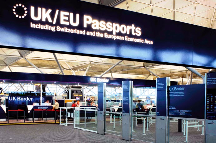
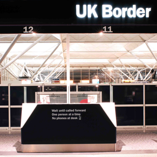
The most significant single improvement in “border visibility” (bearing in mind the media critique that “there’s no border anymore”) was to create a clear blue line of desks and overhead gantry, boldly stating “UK Border”, emphasizing that – even at an inland airport – this is the national borderline.
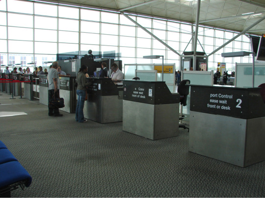
Stansted before the project
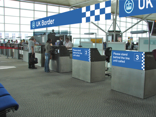
Malcolm Garrett’s initial design concept…
…and as it was eventually installed
To facilitate universal communication of key concepts, AIG designed a range of icons to indicate EU, rest of world, mobile phones, cameras, CCTV, waiting time, no smoking, passport control, removing passports from holders, landing cards and information.
An initial installation of the new style was implemented at Stansted Airport and all terminals at Heathrow and Gatwick in order to demonstrate rapid response to public concerns. A prototype permanent border environment was then designed, built and installed by AIG Lacock Gullam at Stansted Airport prior to national roll-out of the new, coordinated scheme.
The meeting also heard from Chris Hurrey, Assistant Director of the UK Border Agency, who gave the client view of the project, confirming that it was proving effective in delivering the government’s objectives. In the discussion that followed, the airport operator’s experience of this complex, tripartite project was also well represented by the Sign Design Society chairman, Mike Wolff, who was BAA’s sign design manager during the project development and implementation.